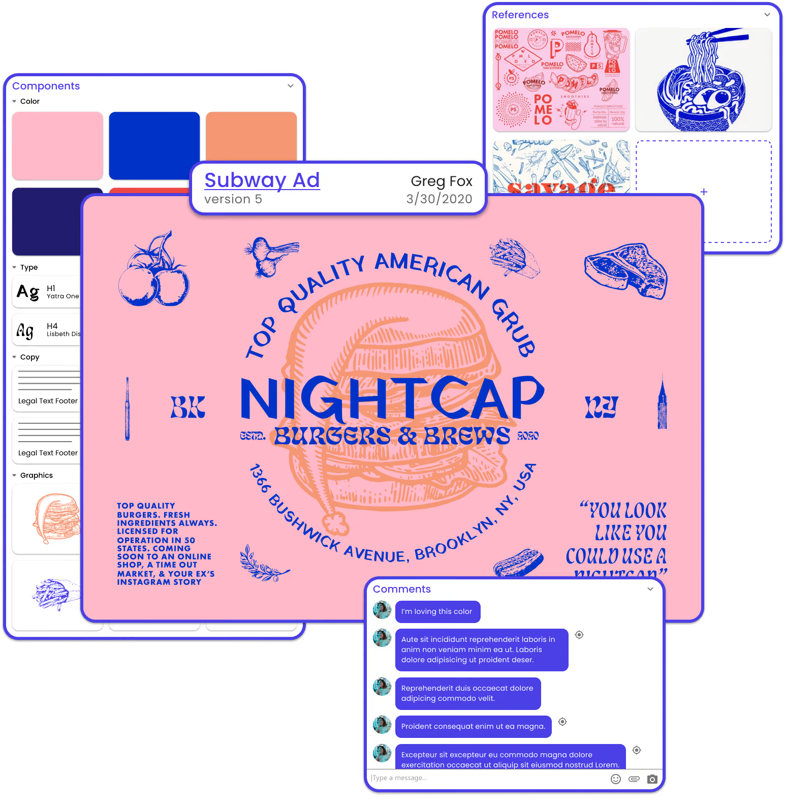
Pique is a software platform that will redefine the way graphic designers collaborate with co-workers and clients.





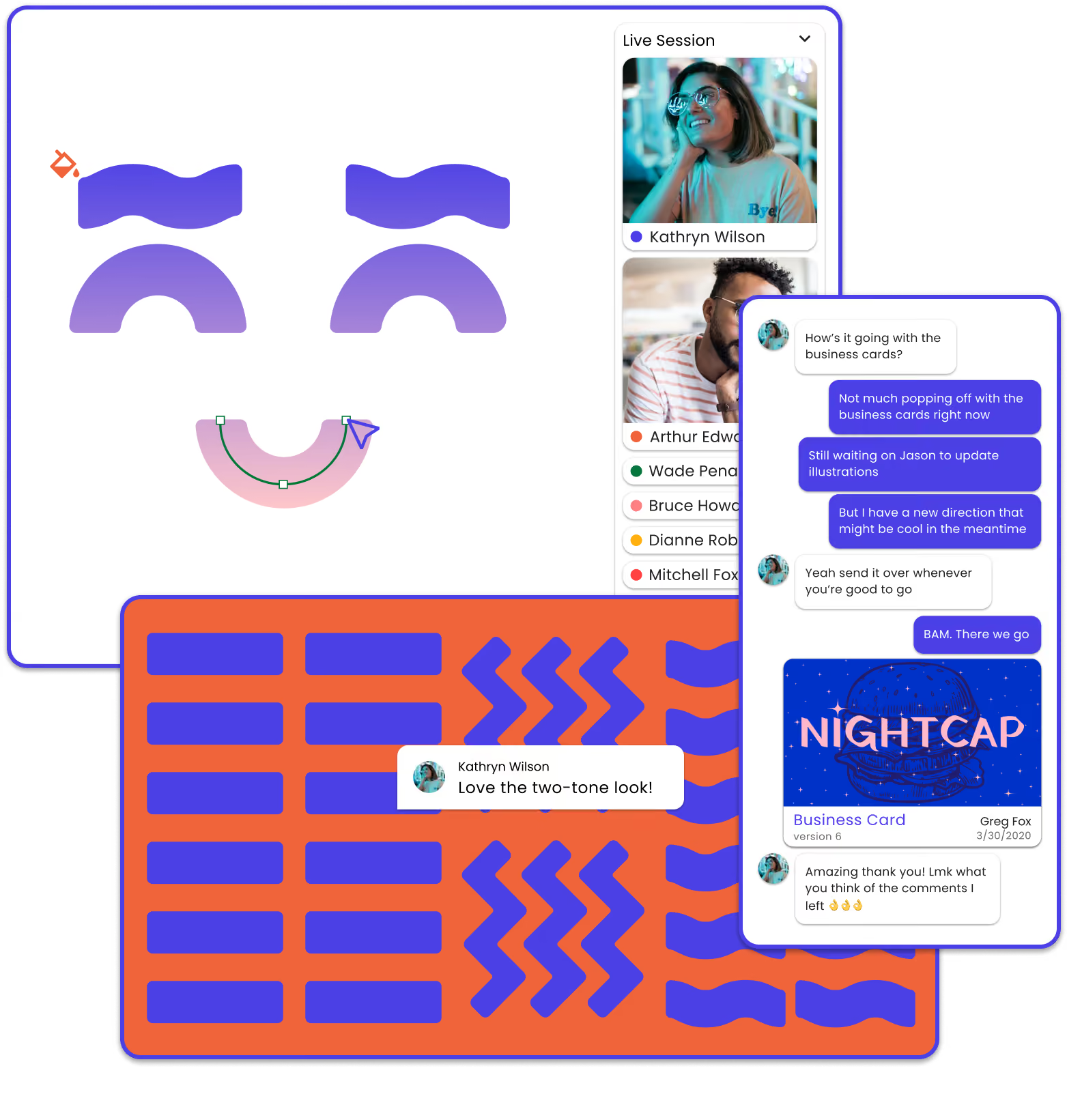
Collaboration
Pique is the first graphic design software built from the ground up for collaboration.
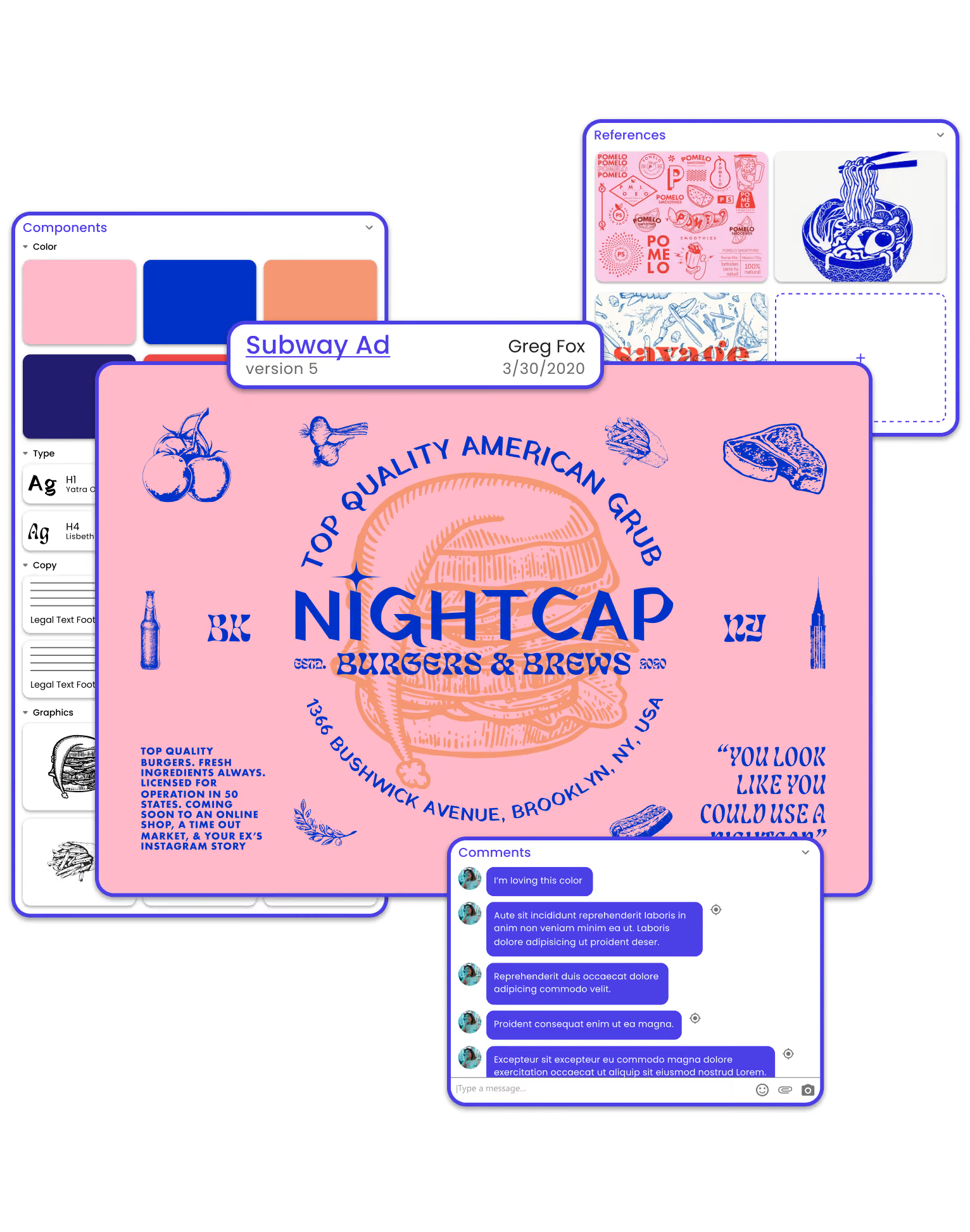
Organization
Pique’s organizational features ensure you’ll never spend another minute searching for that file from last month.
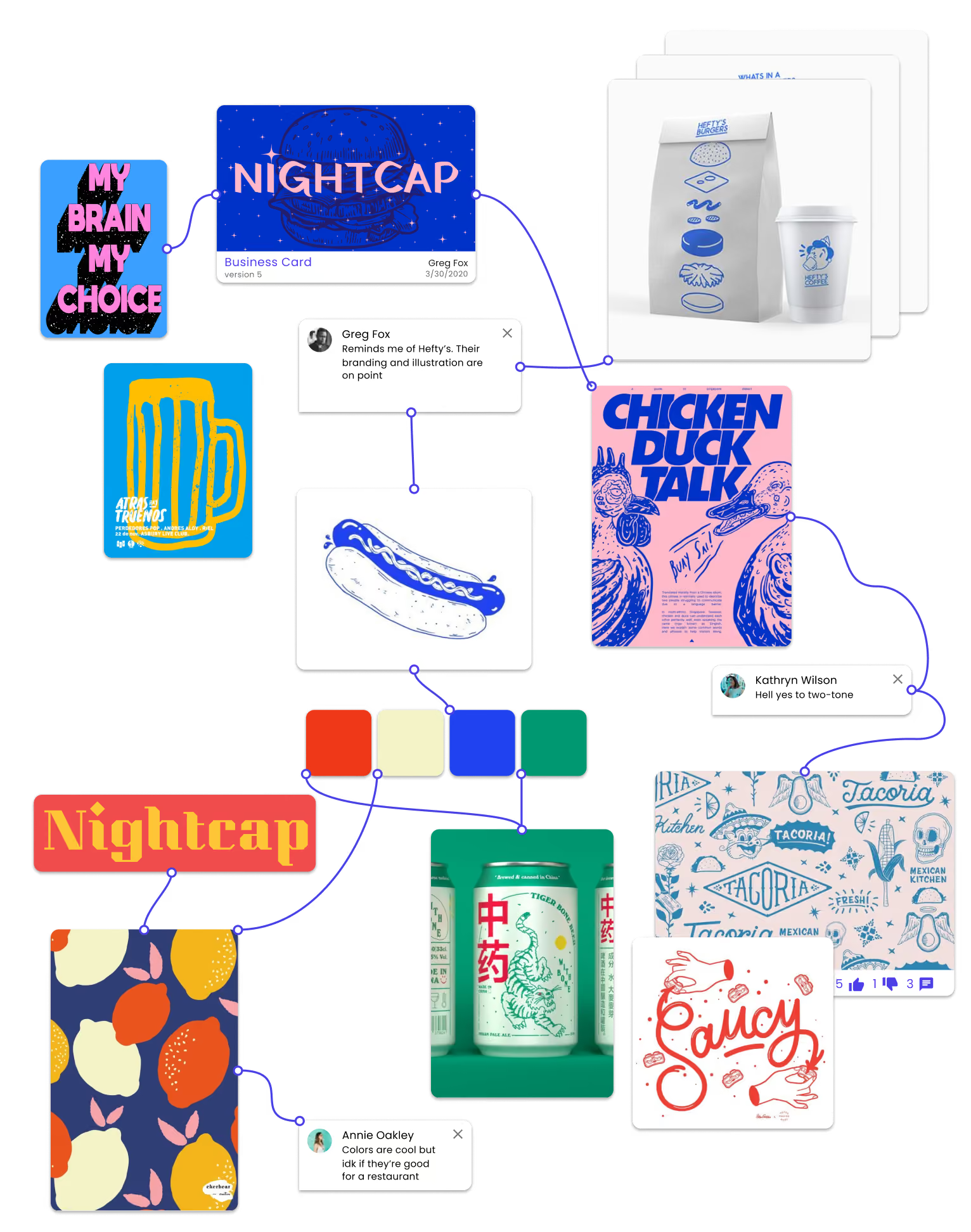
Inspiration
Pique's mood boards go above and beyonds the Pique’s mood boards go above and beyond the capabilities of current tools. Find inspiration, experiment, and present ideas - all in one place.
Creation
Pique is the first graphic design software built form the ground up for collaboration.
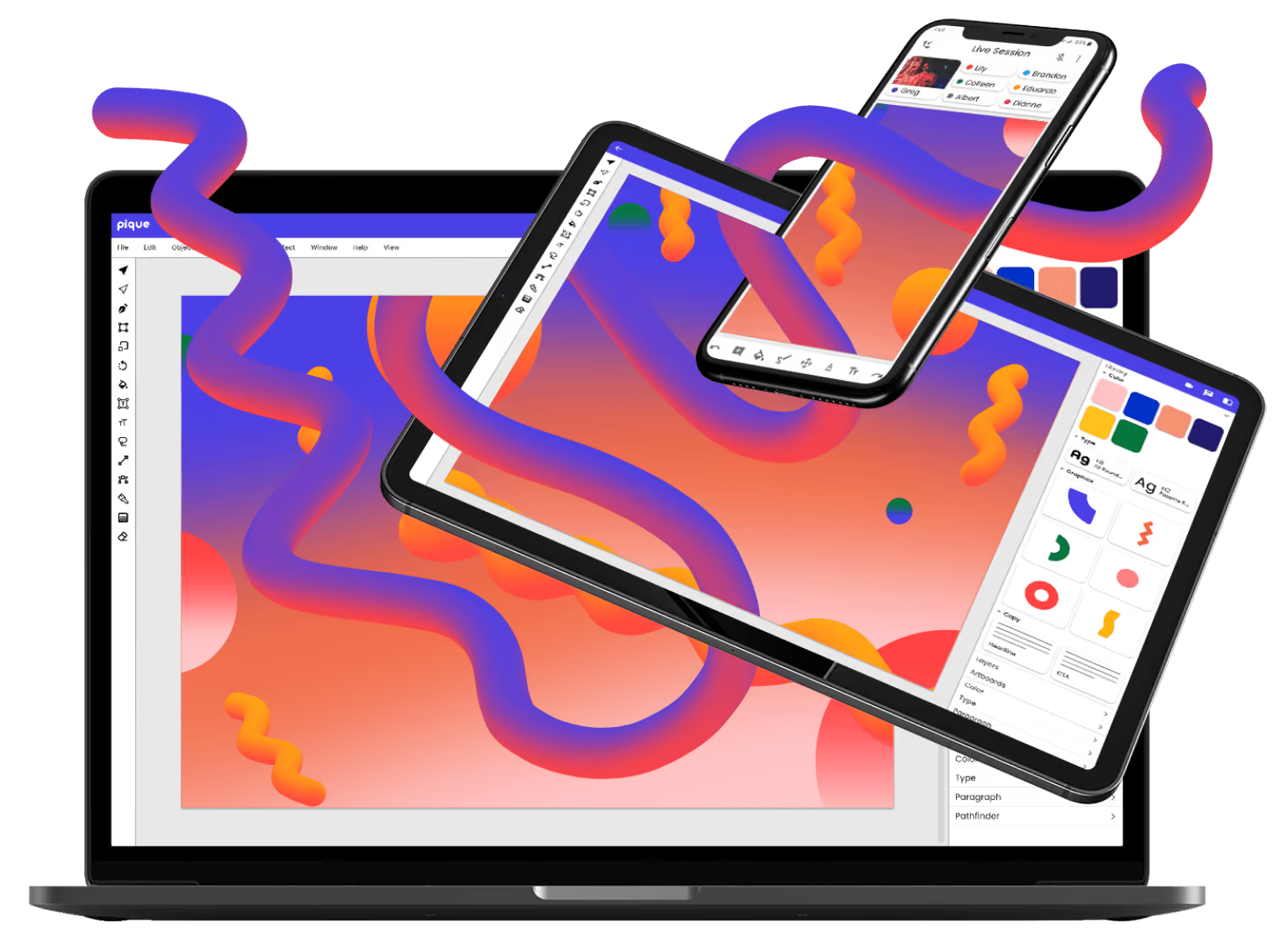

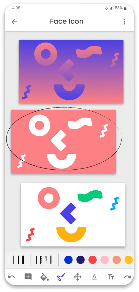
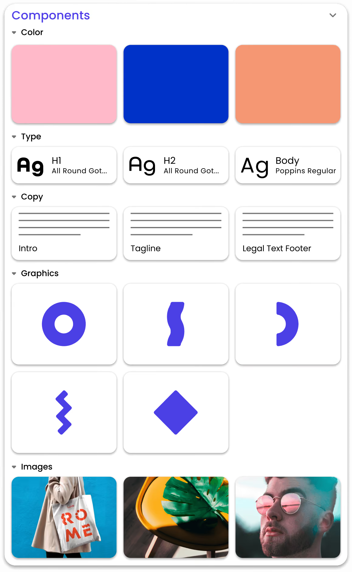
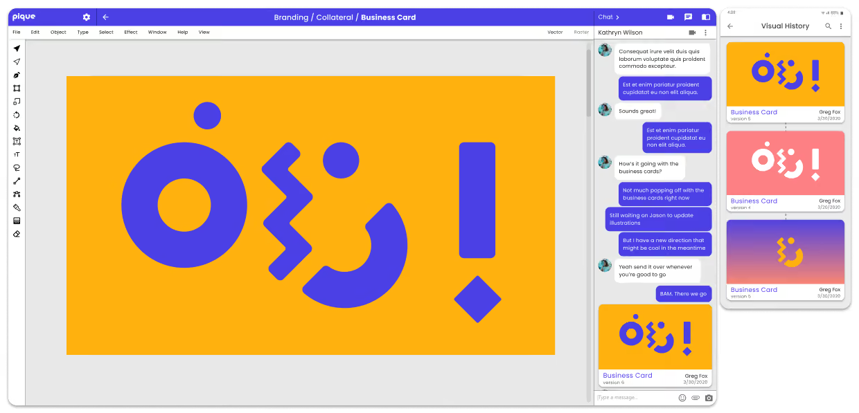
For legal reasons, Pique isn't ready to be shown publicly yet. If you're a potential employer (or friend), hit me up and I'll be happy to share the link with you.
Long story short - to help graphic designers collborate better with clients and coworkers.
This project began with a couple months of pure research - interviewing designers, conducting product landscape audits, and finding the opportunities for innovation. This was followed by a great deal of ideation and user validation. Next, I built a design system, created prototypes, and designed a brand.
Pique currently exists as an interactive prototype in mobile, web, and plugin form. A second iteration, based on user feedback, is under development now.
I interviewed a bunch of people who work remotely to figure out what issues they face. I was primarily interested in what barriers they face in communicating with clients and coworkers.
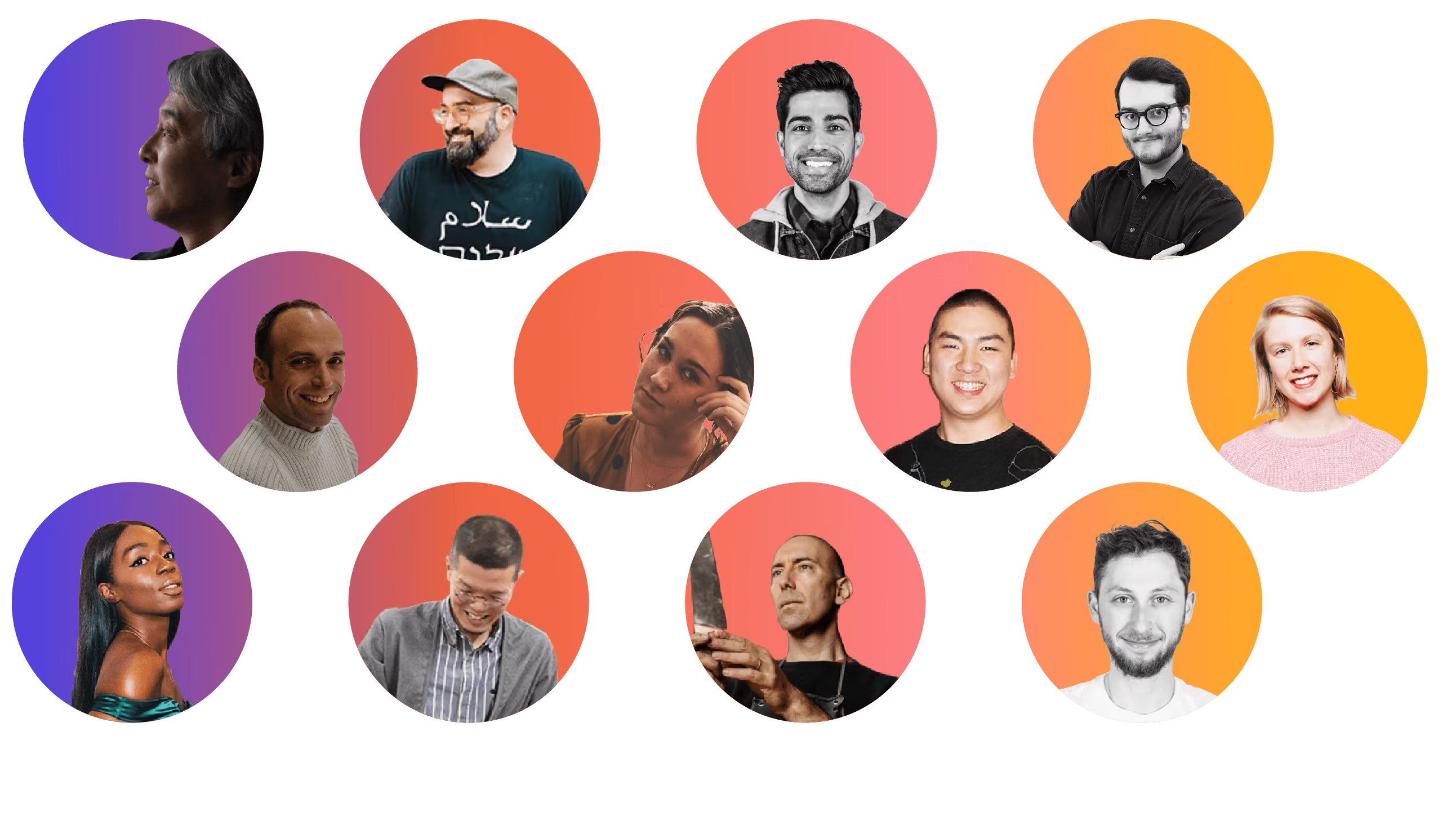
I gained a lot of great insights from talking to these people, but one stood out to me in particular, and served as the launching off point for the project:

I distilled all my findings down to three key issues:

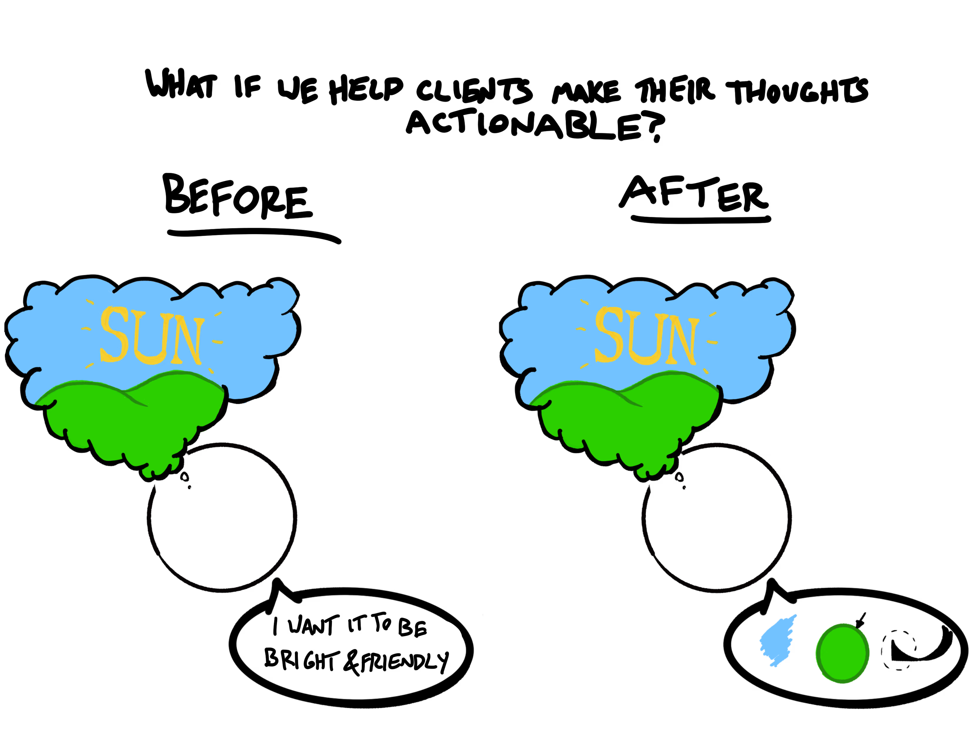
It’s very difficult to communicate visual and formal ideas through an email paragraph. Designers and clients need the ability to communicate easily in a visual way. Additionally, clients often don’t have the design literacy to communicate the great ideas they have in their head.

We’ve all found ourself playing email tag at some point. It’s just part of the game - but it doesn’t have to be. Instant messaging and video calls rectify this issue somewhat, but nothing beats face-to-face response time.
Anyone who’s had a peek at a designer’s work folder will understand. Even the most zenlike organizers will find themselves overrun with versions and variations. Constant exporting of files for review only compounds this issue.
That moment when you ask someone to come over and take a quick peek at what you're working on. This is a core aspect of what make real-life collaboration so efficient. This is sorely missing from remote collaboration.

I made a couple personas to help guide my design decisions. Since this system isn't just for designers, I needed to take into account the people they'd be working with as well.
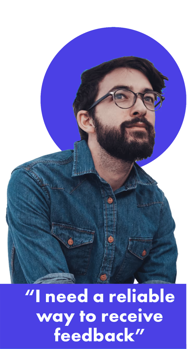



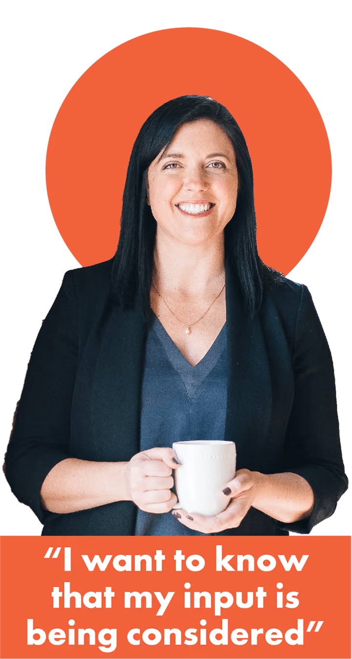



With my issues and personas defined, I visualized the current experience, and how it could be improved.
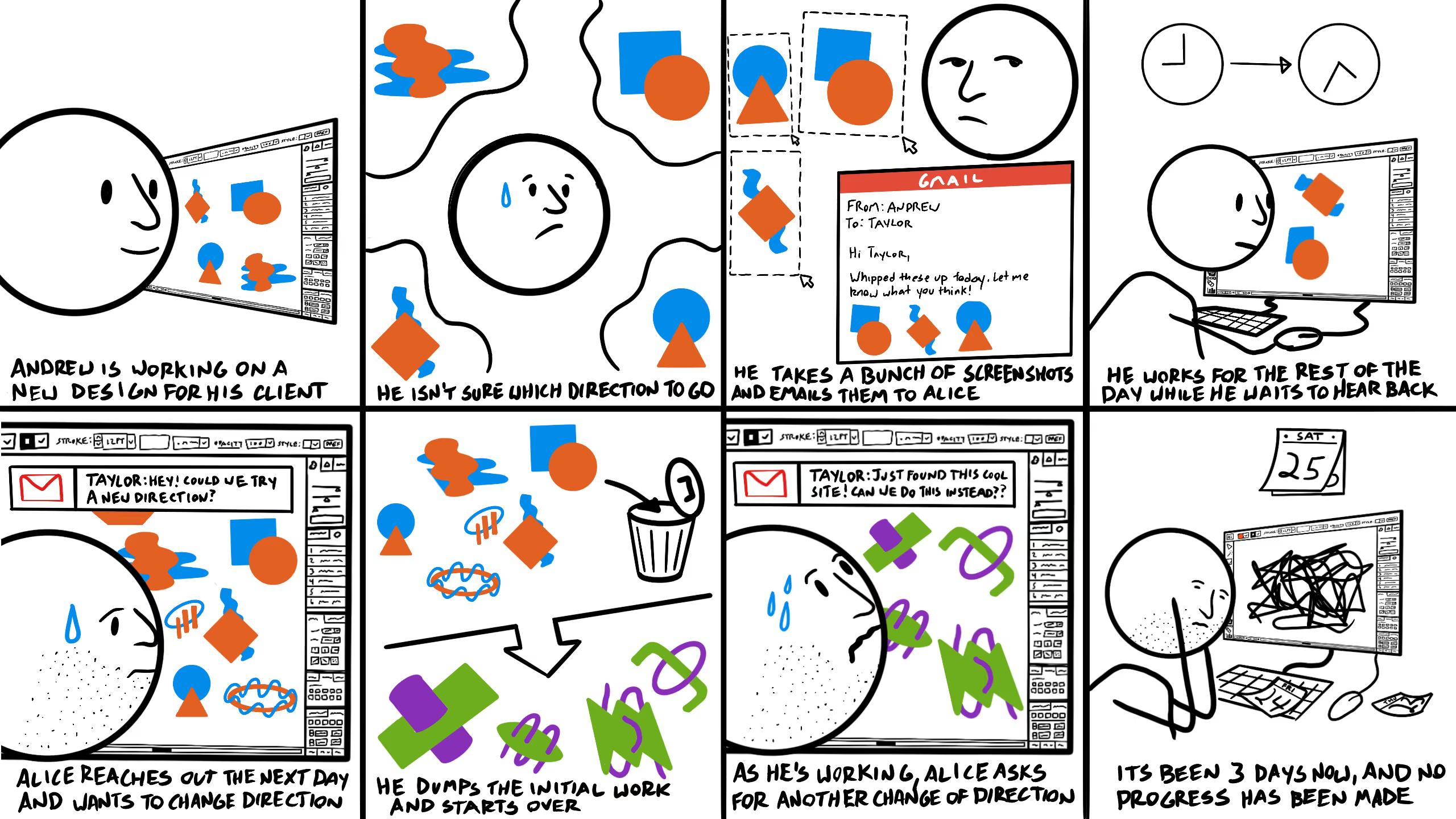
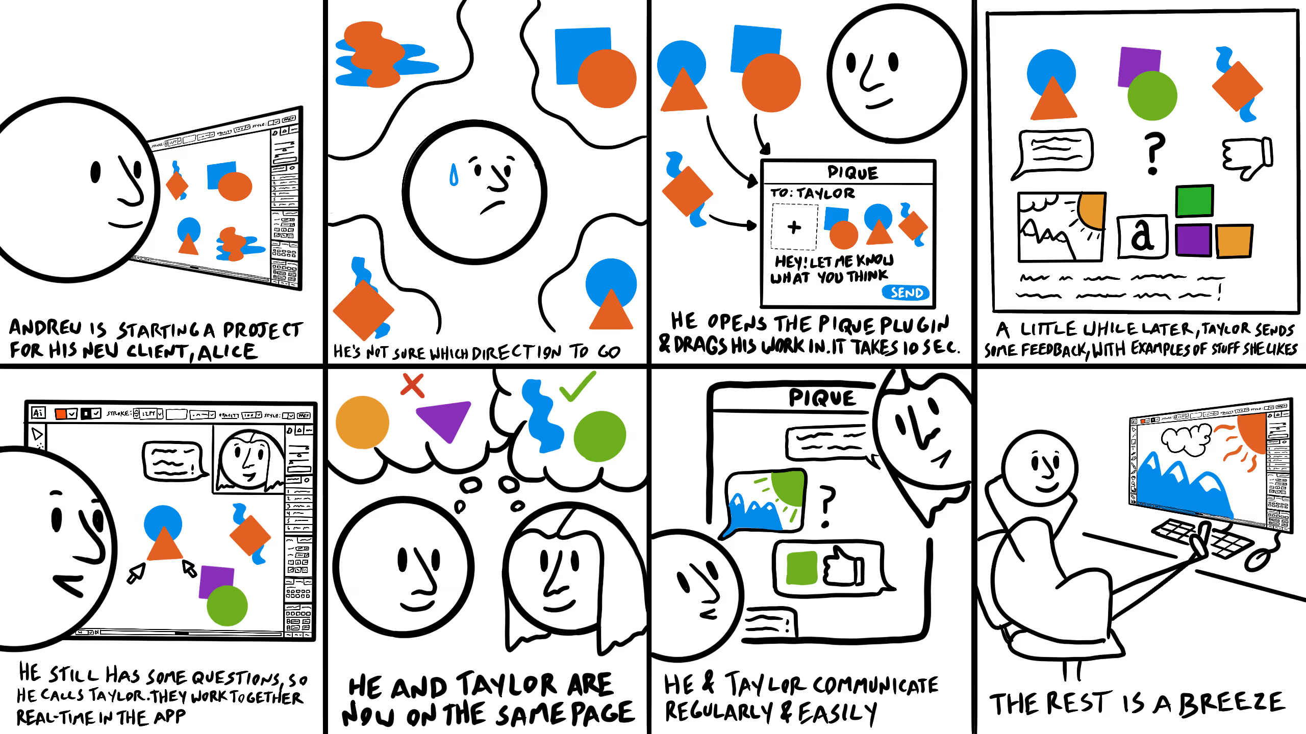
With a broad vision in mind, I began thinking of features that could alleviate the problems I had discovered. I started off broad before refining the details.
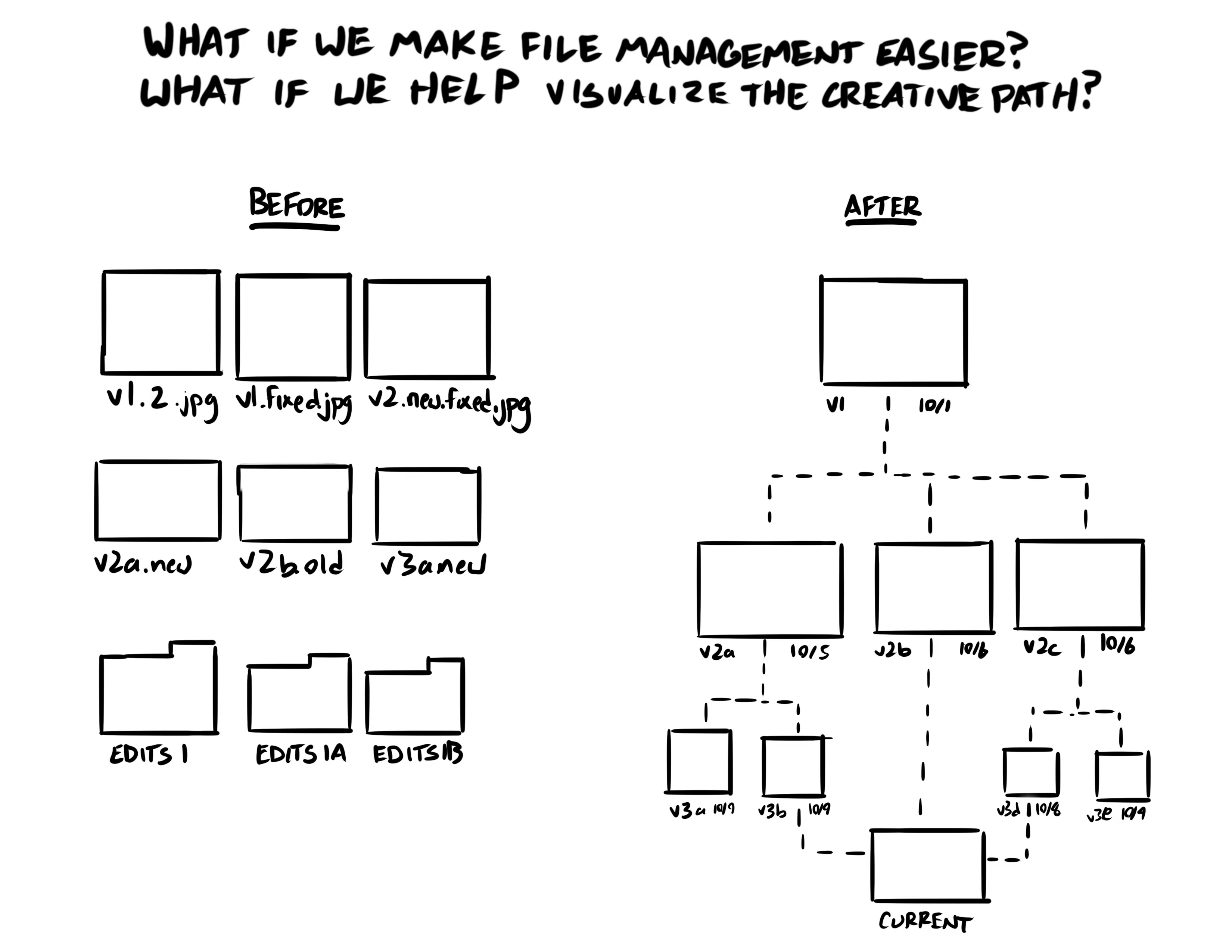
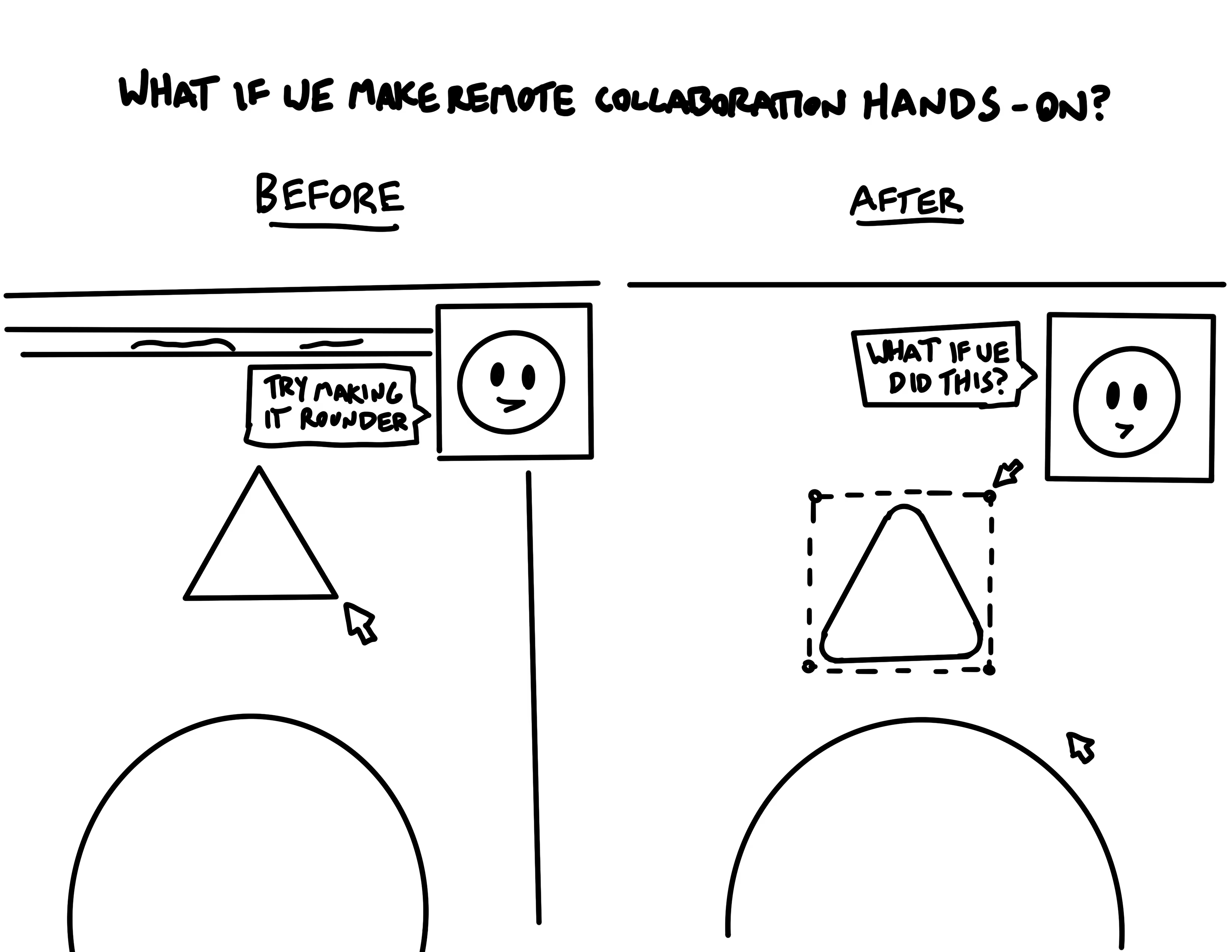

Before working out the details of these ideas, I needed a rock-solid understanding of the graphic design process.

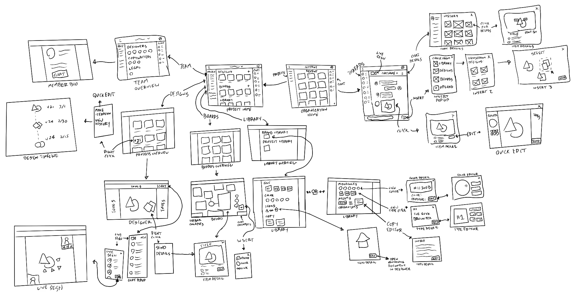
Sketching out a sitemap before jumping onto the computer
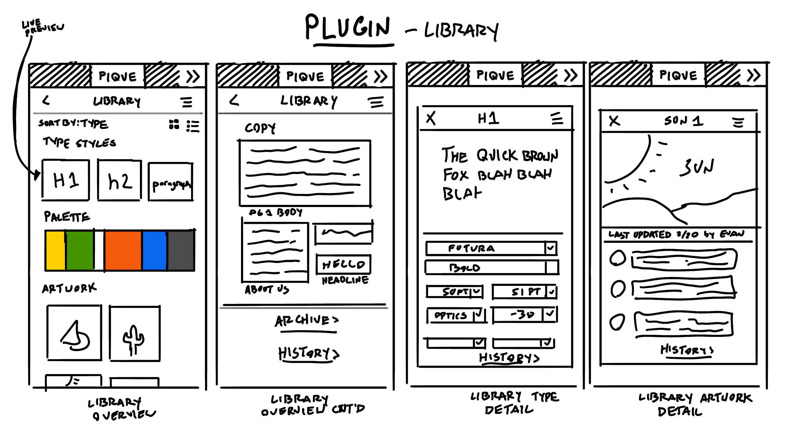
Sketching and building quick wireframes in Figma
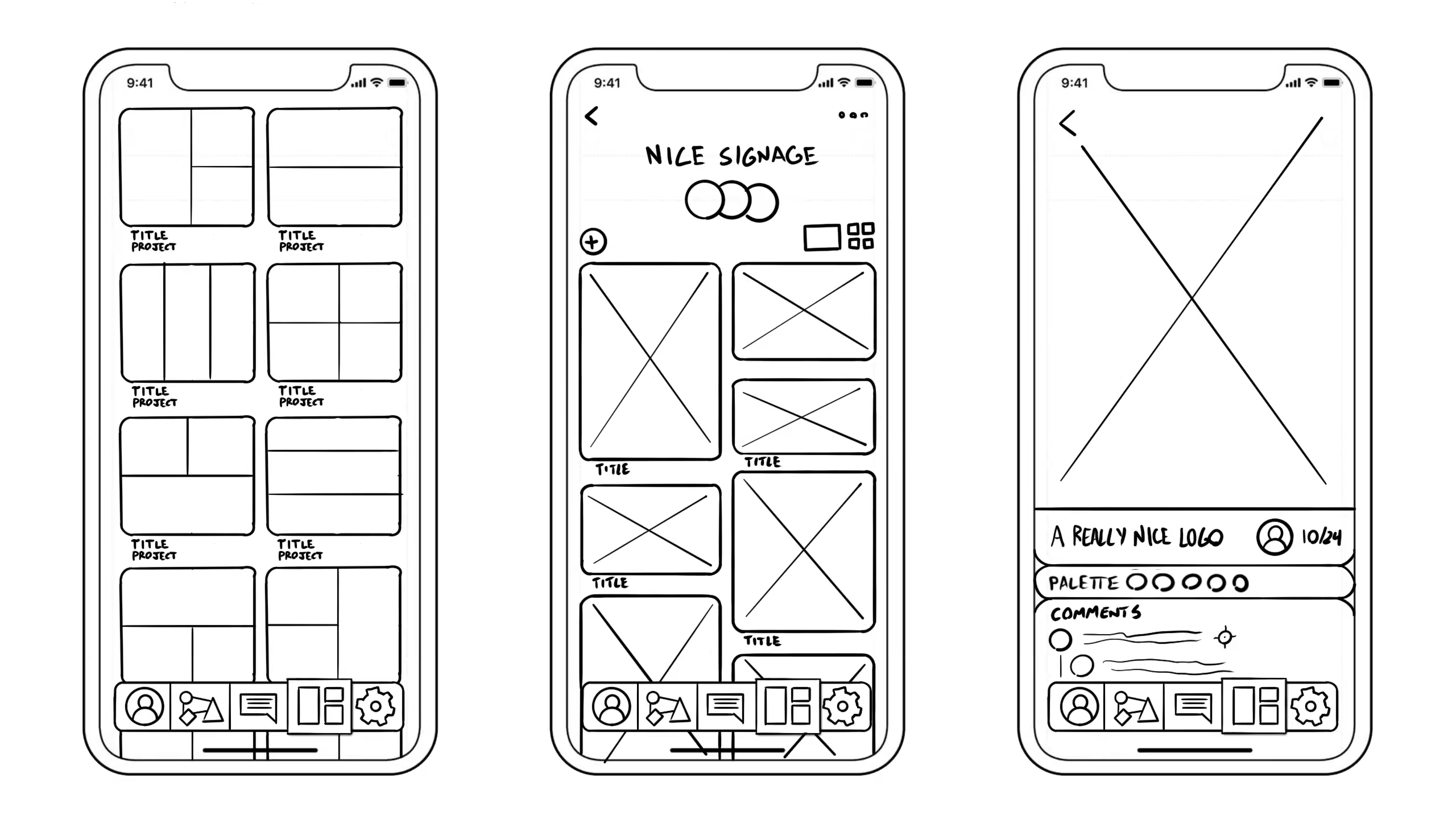
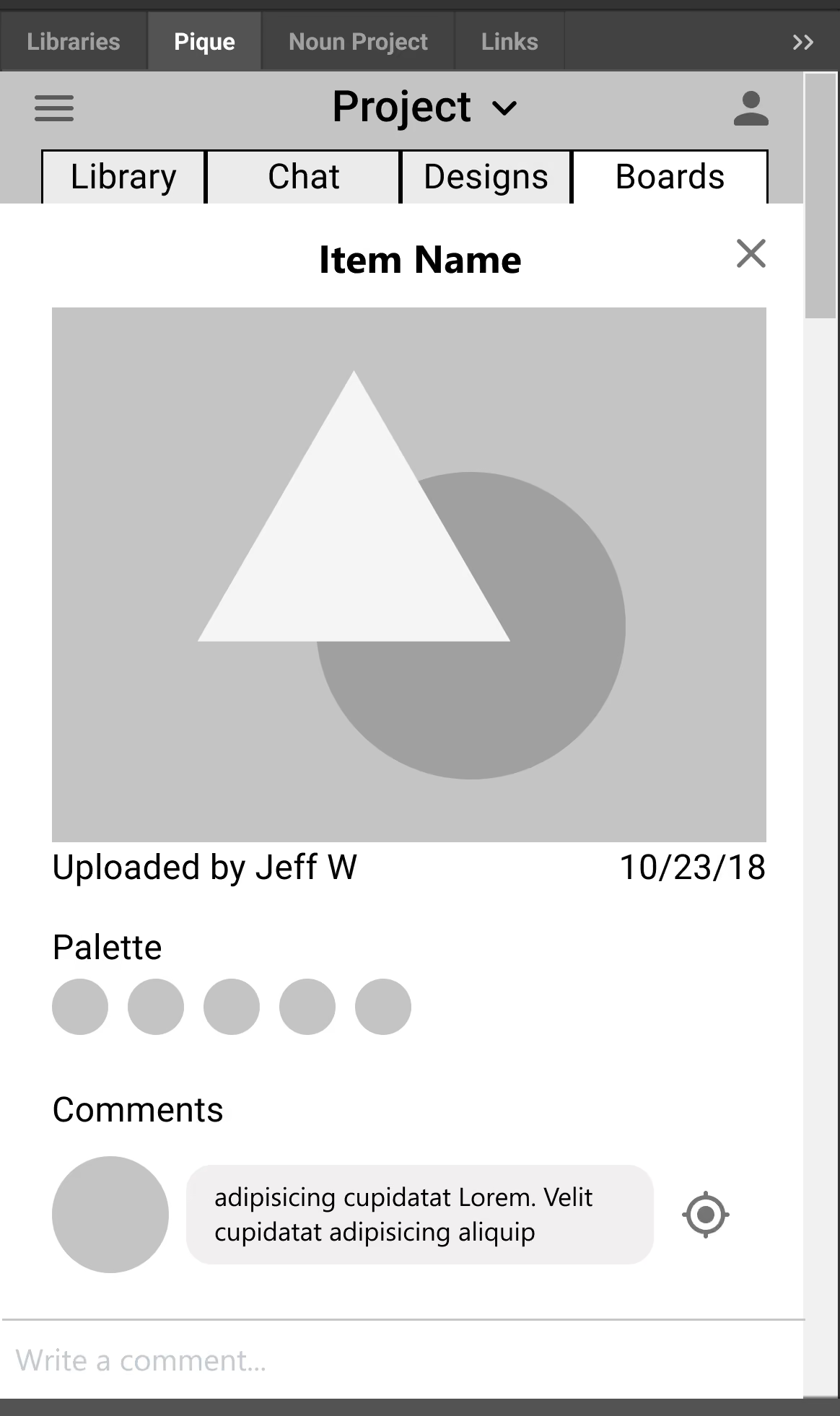
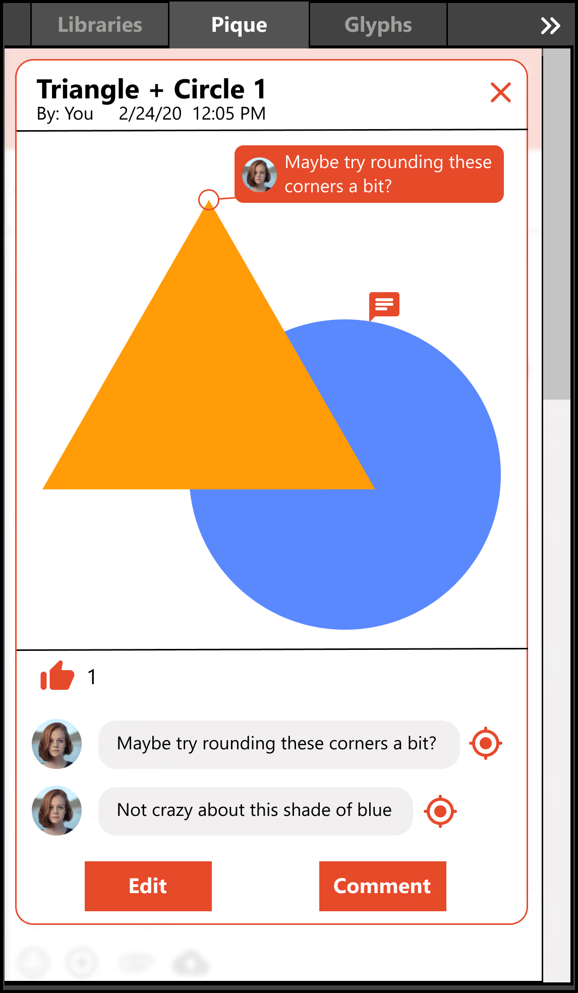
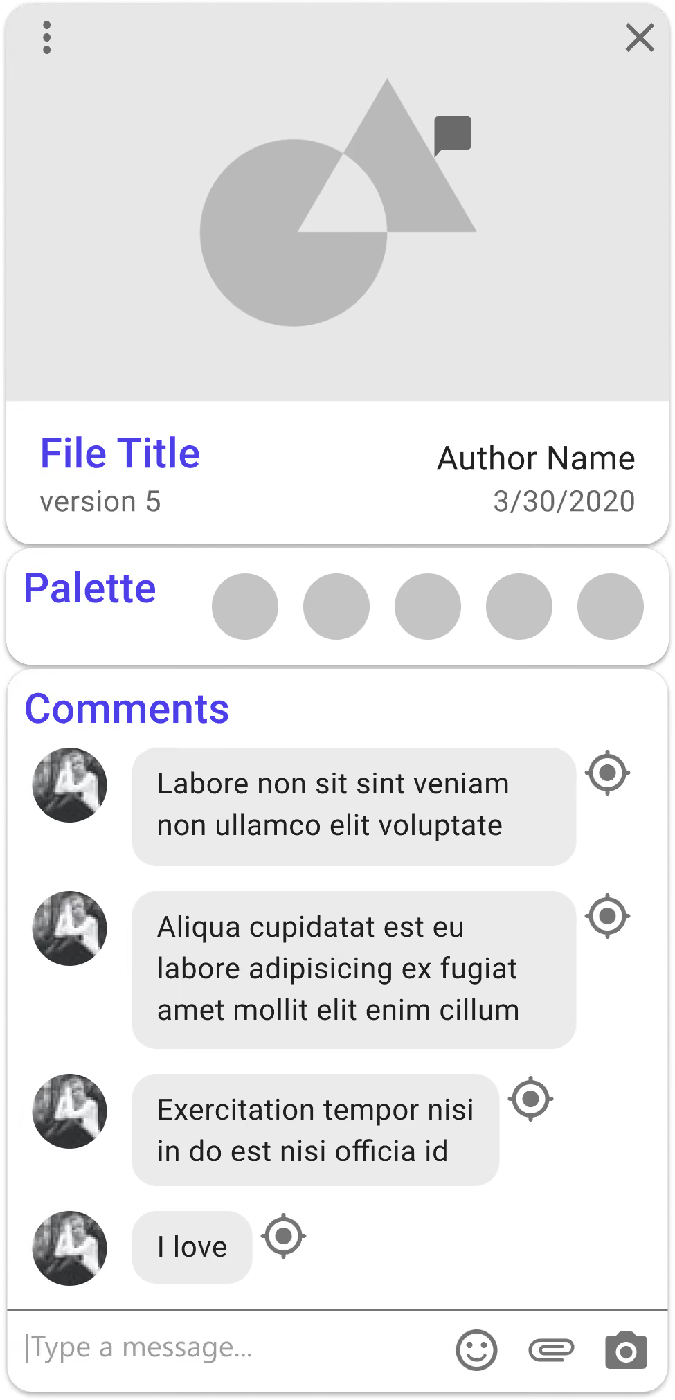
Testing the first interactive prototype with real graphic designers

Once I had a solid idea of what the application would consist of, I began building a design system. Basing my system on Brad Frost's Atomic Design framework helped me keep things consistent and iterate rapidly.

Pique had to be more than just a design system - I wanted it to be a true brand.
Scalable
Visual
Efficient
Sociable
Futuristic
Hard-working
Collaboration
Productivity
Creativity
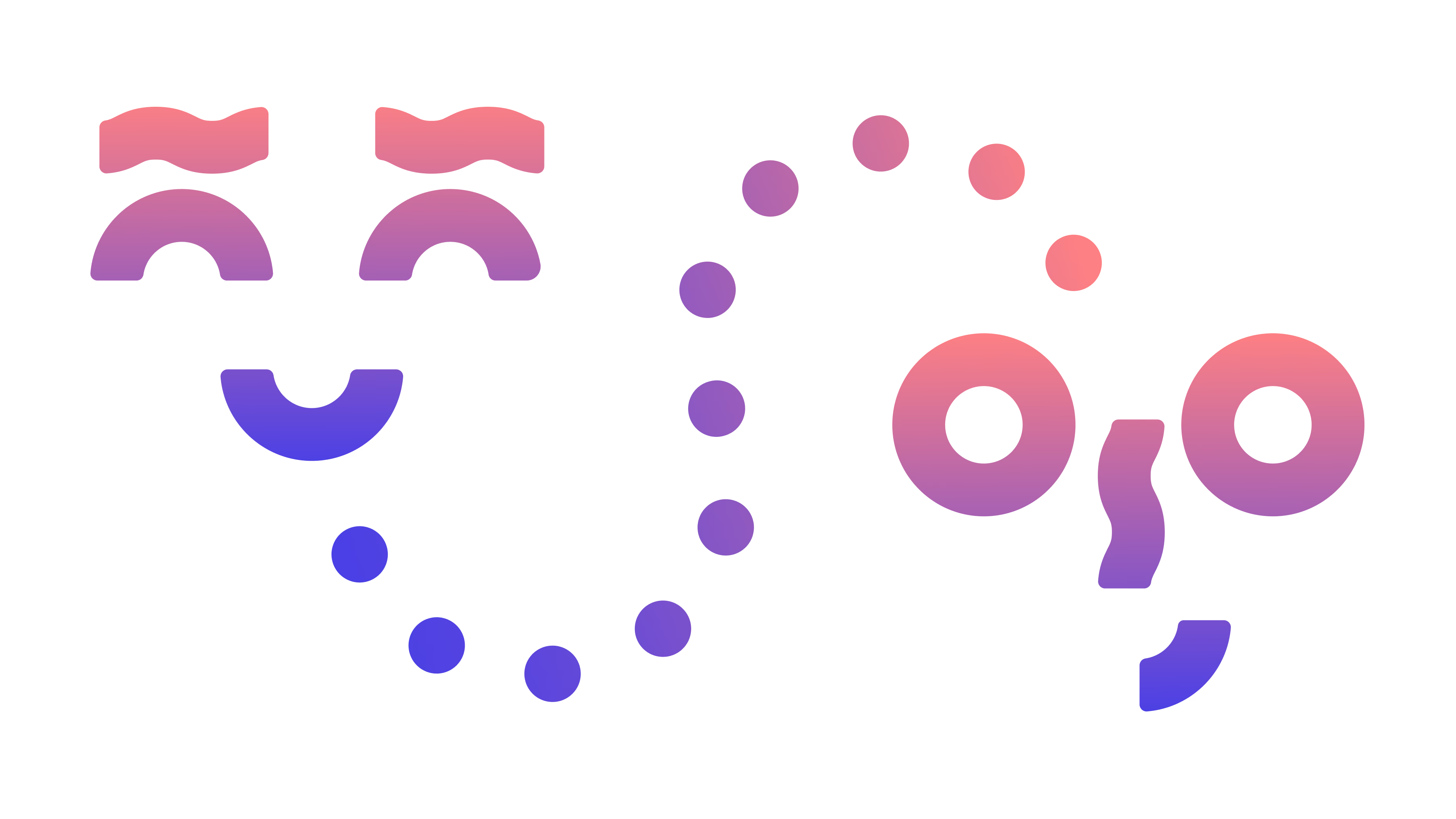
To ensure Pique was visually cohesive, I create a geometric system around which the logo and other visual assets are based.


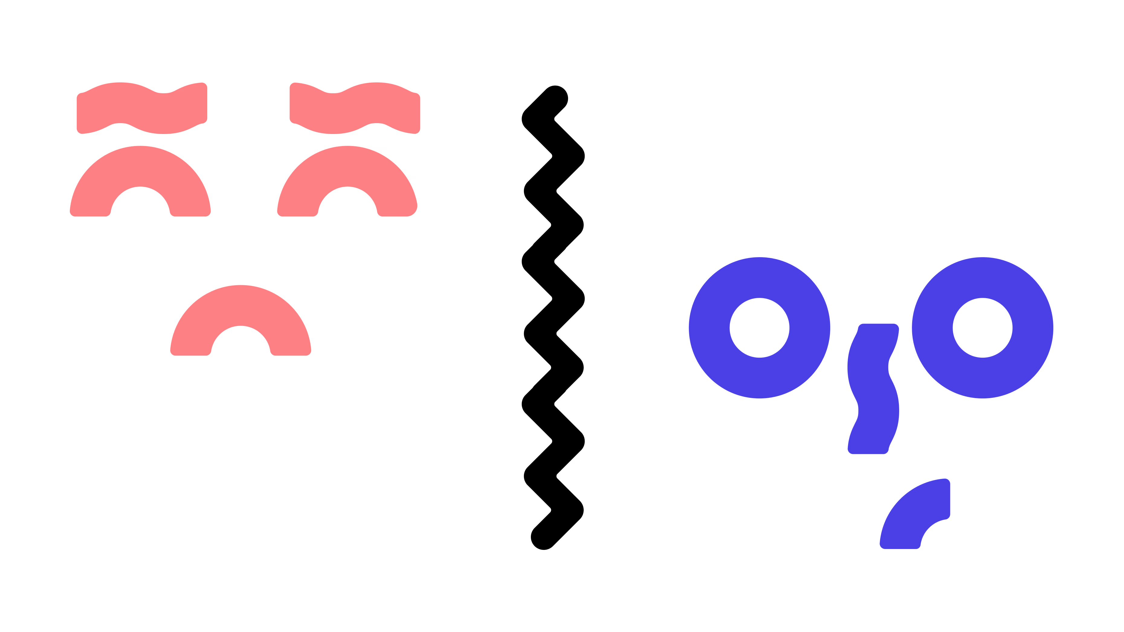
Just like the brand itself, Pique's type is friendly and fun but not afraid to roll up its sleeves. All-Round Gothic was chosen for headings due to its similarity to the bespoke logo. Poppins fills in for the rest, adding a lot of versatility.
A B C D E F G H I J K L M N O P Q R S T U V W X Y Z
a b c d e f g h i j k l m n o p q r s t u v w x y z
1 2 3 4 5 6 7 8 9 0 ! @ # $ % ^ & * ( ) + =
A B C D E F G H I J K L M N O P Q R S T U V W X Y Z
a b c d e f g h i j k l m n o p q r s t u v w x y z
1 2 3 4 5 6 7 8 9 0 ! @ # $ % ^ & * ( ) + =
Pique's palette represents passion through its warmth, sociability through its vibrance, and flexibility through its breadth.
#4B40E6
#FE6A3C
#19A964
#FC8084
#FFB20E
#03A9F4
Pique's imagery is vibrant and eclectic in style, meant to hint at the limitless creative opportunities it represents.